For the assignment I was asked to illustrate a story for a magazine. I chose to make a food magazine and with the help of my friend Liat, we made lots of fun, very good food and of course, the assignment.


 Tutor comments:
Overall Comments
Well done, Orly for submitting the last of the assignments on Photography 1. You
have worked well and have managed to remain focussed and enthusiastic for the
whole course. I have really enjoyed this journey with you, and the last assignment is
no exception.
Feedback on assignment
Elements to consider with your assignments:
For this assignment you need to choose an appropriate subject matter in keeping
with one of the three given headings of ‘A Commodity’, ‘Light’ or ‘Holidays’ or a
suitable alternative theme. Content images needed to be chosen for their ability to
work together to strengthen the narrative, while the cover picture should give the
audience an understanding of what to expect from the story.
You have been given unlimited scope to be creative with this assignment and
have the added benefit of being able to add text to strengthen the reading and
interpretation of the images. Strong creative examples could show interesting ideas,
unusual situations or the evidence of something happening. Cover illustrations
should give a sense of narrative with and without the use of text.
Technical skills should be in keeping with the exercises undertaken throughout the
course.
Communication
Communication is a much stronger element within this assignment. Elements of
communication include the message conveyed to the audience in photographs, the
anchoring of text and your own intentions and understanding behind the images.
Your assignment in connection with the above points
Design and Selection
Theme
The theme chosen of a ‘Cookery Magazine’ is appropriate and very individual.
You have produced a good selection of images for this theme, providing a clear
understanding of how to make Polenta.
Cover Illustration/ Page One
You have presented the finished dish here as your cover page with appropriate
supporting text. This works very well, providing the audience with a good
understanding of what is to follow, and giving a very colourful interpretation of the
finished product. This kind of photography can be tricky with light reflecting on the
food, but you have handled the task well. Watch having the text too close to the
edges of the frame. It is normal to allow a little are around the edges to be just image.
Page Two
This picture of the corn kernels is probably lovely, but it is not visible behind the text.
Equally the text is quite difficult to read in this manner. It may have been better to
have the text alongside the image, although the content matter is relevant to the
article.
Page Three
You have presented a lovely page here. Both of the images are clear and well
composed giving lovely strong colours. Your supporting text works well and the
background colour is cheerful. Well done.
Page Four
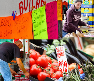
The four images here work equally well. The positioning lined up along the right hand
side works well, and the same background colour as previous adds some uniformity
to the magazine. The images are well composed and colourful, although I would
ideally like to see the tomato picture a stop brighter to be in keeping with the rest of
the vegetables.
Page Five
This set of images is not quite as clear and sharp as the previous and I feel that you
could have done with a better depth of field across the frames. I’m not sure what
settings you have used for these shots, or how affected by light levels you were. The
positioning of the text continues to work well though, and the layout is strong.
Page Six
I have the same comments as above here, and I feel that you may have been
struggling with the light. Perhaps you needed to ‘mock’ this shot up in better lighting.
Page Seven
There’s a better balance of tones across this page with the top images looking sharp
and clear. The butter shot, in particular, could do with a stronger light source, and
may have worked better shot out of doors if possible.
Page Eight
These images work very well together. Well done.
Page Nine
This image works well, Orly giving a nice view of the finished product. I wonder if you
could have used a reflector effectively to add a little more light to the centre of the
dish? However, it gives us a nice rounding off of the project.
Page Ten
I’m not sure you really needed to show the empty plate here! It is not so attractive to
have a photograph of a dirty plate, though I do get the point, of course.
Creativity and originality
This has been a nice final project, Orly and shown that you have a good sense of
design.
Technical Competence
You haven’t given me any technical notes around you images for this assignment,
but on the whole the images have been well taken and make good use of available
light.
Communication
Your text has worked very well to round off the narrative, and give us a clear
understanding of the process of making a lovely Polenta dish.
Summary
You have produced a nice last piece of work with a good range of images and
supporting text.
Please accept my congratulations for completing the course. I hope that you have
enjoyed it as much as I have enjoyed looking at your work. I wish you all the best
for the future and hope that your enthusiasm for photography continues to grow.


